Notes Component: WYSIWYG Toolbar Appears Only at Bottom of Component #43
Description
WYSIWYG toolbar in the Notes component is fixed to the bottom, forcing users to scroll long notes to access formatting options.
Summary
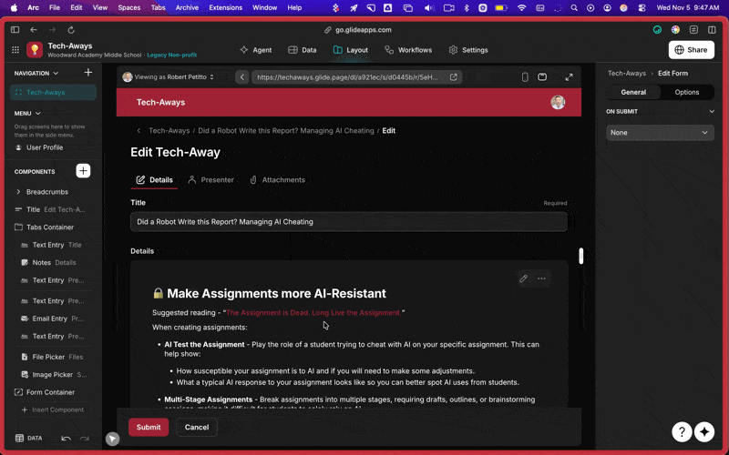
Partners have reported that when editing long notes within the Notes component, the WYSIWYG toolbar only appears at the bottom of the component. This forces users to scroll extensively to apply formatting, making editing cumbersome and inefficient. Ideally, the toolbar should remain visible or accessible near the user’s cursor during editing.
Current Problem
When users write or edit long-form text, the formatting toolbar remains anchored at the bottom of the component. For large blocks of text, users must repeatedly scroll down to the bottom to access formatting tools (bold, italics, bullets, etc.), breaking the writing flow and reducing usability.
Examples/Scenarios
- A user writing multi-paragraph notes must scroll several screens down to bold a section or add a list.
- Partners embedding Notes components in long form layouts find this behavior frustrating, especially when notes are used for detailed descriptions, internal logs, or instructions.
- The issue appears in edit screens and form views where Notes are editable.
Why This Matters
Improving the toolbar placement or behavior would significantly enhance editing efficiency and reduce friction for users who rely on long-form input. It would improve usability for both partners building apps and their end-users maintaining detailed records.
Suggested UX
- Floating Toolbar: The WYSIWYG toolbar should remain visible as users scroll — similar to sticky toolbars in editors like Notion or Google Docs.
- Contextual Toolbar: Optionally, the toolbar could appear near the text cursor when text is selected.
- Alternative Option: Allow positioning the toolbar at the top of the component instead of the bottom through a configuration toggle.
Reference:
CleanShot 2025-11-05 GIF