


Tip
Canonical docs: cards.flixlix.com/power-flow-card-plus. This README is the offline copy. The docs site has the configuration reference, a live playground and copy-paste examples.
Note
This card is distributed via flixlix/power-flow-card-plus, but the source code lives in the monorepo at flixlix/flixlix-cards. Issues and feature requests will be tracked there going forward.
- UI Editor!!! 🥳
- Multiple Language support (🇺🇸, 🇩🇪, 🇵🇹, 🇪🇸, 🇧🇷, 🇳🇱, 🇮🇹, 🇫🇷, 🇷🇺, 🇫🇮, 🇵🇱, 🇩🇰, 🇸🇰, 🇨🇿)
- Bidirectional Individual Entities
↕️ - Secondary Information for all circles ℹ️
- Display Grid Power Outage ⚡️
- Template functionality 📙
... and More:
- Option for card full size
- Add Grid Tolerance for small values, to not display the battery correcting grid values
- New and improved Flow Rate Model
- Choose whether or not to color icons, text, etc.
- Display Individual power entities
- Customize Individual entities' label, icon and color
- Configure whether to hide Individual Entity when state is 0 or unavailable
- Clickable entities (including home)
- Fixed crooked lines
- Have curved lines connect to the Circles
- Keep color of battery to grid line, even when not returning
- Display Low Carbon Energy from the grid
- Customize Low Carbon Energy label, icon, circle color, icon color and state type
- Customize Battery, Solar and Home's color, icon, color of icon and label
The Goal of this card is to provide an easy to understand and visualize way of displaying the current Power Distribution coming from and to different sources, such as solar, grid, home batteries etc. Furthermore, this card aims to expose a lot of customizability and control of its behavior to the configuration, allowing users to tailor it to their specific requirements.
This card does not aim to display Energy Values (Meaning accumulated power over 1 day, for example). If this is your goal, check out the Energy Flow Card Plus.
In case you want to watch a tutorial instead of reading through this very long readme 😅, I recommend the following videos:
- Power Flow Card Plus in Home Assistant - Jetzt noch besser? Anleitung from Smartzeug - in german, up to date with version 0.2.2
- Power Flow Card Plus for Home Assistant from Speak to the Geek - changes in indvidual configuration

This card is in the default catalog. On Home Assistant 2026.11 and newer, go to Settings → Marketplace, search for "Power Flow Card Plus" and install it. Before 2026.11, search for it in HACS and download it 🙂
Manual install
-
Download and copy
power-flow-card-plus.jsfrom the latest release into yourconfig/wwwdirectory. -
Add the resource reference as decribed below.
If you configure Dashboards via YAML, add a reference to power-flow-card-plus.js inside your configuration.yaml:
resources:
  - url: /local/power-flow-card-plus.js
    type: module
Else, if you prefer the graphical editor, use the menu to add the resource:
- Make sure, advanced mode is enabled in your user profile (click on your user name to get there)
- Navigate to Settings -> Dashboards
- Click three dot icon
- Select Resources
- Hit (+ ADD RESOURCE) icon
- Enter URL
/local/power-flow-card-plus.jsand select type "JavaScript Module". (Use/hacsfiles/power-flow-card-plus/power-flow-card-plus.jsand select "JavaScript Module" for HACS install if HACS didn't do it already)
Important
The reference below is kept for offline reading. The canonical version is cards.flixlix.com/power-flow-card-plus/configuration — grouped options, a playground and copy-pasteable examples.
Warning
This card offers a LOT of configuration options. Don't worry, if you want your card's appearance to match the official Energy Flow Card, you will only need to setup the entities. The rest of the options only enable further customization. If this is your goal, please go to Minimal Configuration or the Examples page on the docs site.
| Name | Type | Default | Description |
|---|---|---|---|
| type | string |
required | custom:power-flow-card-plus. |
| entities | object |
required | One or more sensor entities, see entities object for additional entity options. |
| title | string |
Shows a title at the top of the card. | |
| dashboard_link | string |
Legacy, kept so existing configs still work: use buttons instead. Shows a link to a dashboard, e.g. /energy. The visual editor offers to convert it to a button. |
|
| dashboard_link_label | string |
Go To Energy Dashboard (auto-translates) | Legacy: the label of dashboard_link. |
| second_dashboard_link | string |
Legacy: a second link like dashboard_link. |
|
| second_dashboard_link_label | string |
Go To Energy Dashboard (auto-translates) | Legacy: the label of second_dashboard_link. |
| buttons | list |
More buttons at the bottom of the card, after the dashboard links. See Buttons. | |
| kilo_decimals | number |
1 | Number of decimals rounded to when kilowatts are displayed. |
| base_decimals | number |
1 | Number of decimals rounded to when watts are displayed. |
| keep_trailing_zeros | boolean |
false | Always show the decimals a value is rounded to, keeping trailing zeros: 1.0 kW instead of 1 kW. |
| min_flow_rate | number |
.75 | Seconds the quickest dot takes along a 175px line; shorter lines take less, longer lines more. See Flow Formula. |
| max_flow_rate | number |
6 | Seconds the slowest dot takes along a 175px line; shorter lines take less, longer lines more. See Flow Formula. |
| dot_animation | string |
auto |
How the flow dots move: gpu moves them off the main thread, classic uses SVG animation as before v0.4.0. auto picks classic on ARM Mali GPUs, such as the Fire HD 10 (2023), whose drivers draw icons, values and lines in the wrong place with gpu dots. |
| kilo_threshold | number |
0 | The number of watts to display before converting to and displaying kilowatts. Setting of 0 will always display in kilowatts. |
| clickable_entities | boolean |
true | Clicking a circle opens the entity's more info dialog. Set to false to turn it off. |
| min_expected_power | number |
0.01 | Represents the minimum amount of power (in Watts) expected to flow through the system at a given moment. Only used by the duration and speed flow rate models. |
| max_expected_power | number |
2000 | Represents the maximum amount of power (in Watts) expected to flow through the system at a given moment. Only used by the duration and speed flow rate models. |
| display_zero_lines | object |
{mode: "show"} |
Check Display Zero Lines |
| full_size | boolean |
false | Warning: This option is experimental. To use this option, you must set your view to panel mode. If set to true, the card will take up the full height of the screen. And the Card should go to the center of the screen. |
| style_ha_card | css |
CSS Styling to apply to the container of the card (border and background of the card). | |
| style_card_content | css |
CSS Styling to apply to the content of the card (all circles and lines of the card). | |
| flow_rate_model | string |
duration |
How dot speed follows power: duration, speed or relative. See Flow Formula. |
| use_new_flow_rate_model | boolean |
Older alias of flow_rate_model: false is relative, true is duration. Ignored when flow_rate_model is set. |
|
| sort_individual_devices | boolean |
true (since v0.3.1) | If true, sort devices in order of power consumption -> entity id -> alphabetically. |
| allow_layout_break | boolean |
false | Always allow up to 4 individual devices to show, even when there is not enough space, causing visual layout break. |
| topology | string |
standard |
Which wires your installation has: standard, battery_hub or isolated_battery. See Topology. |
The card supports Home Assistant action configs on entity circles and other clickable entity surfaces.
| Name | Type | Description |
|---|---|---|
| tap_action | object |
Action triggered on tap/click. |
| hold_action | object |
Action triggered on long press. |
| double_tap_action | object |
Action triggered on double tap/click. |
If none of these actions are configured for a clickable entity surface, the card falls back to opening more-info unless clickable_entities: false.
buttons adds a row of buttons at the bottom of the card. In the visual editor, open Buttons to add, remove, reorder and edit them.
dashboard_link and second_dashboard_link still work and show before the buttons, but they are no longer in the visual editor. When a config still has them, the editor offers Convert to buttons, which turns each link into a button with a navigate action (or url for a full URL), keeping its label and its place in the row.
| Name | Type | Description |
|---|---|---|
| name | string |
Text on the button. Leave it out for an icon-only button. |
| icon | string |
Icon shown before the name, e.g. mdi:solar-power. |
| entity | string |
Entity for more-info and toggle actions. Without a name or icon, the button shows its name. |
| tap_action | object |
Action triggered on tap/click. Without any action, a tap opens the entity's more-info. |
| hold_action | object |
Action triggered on long press. |
| double_tap_action | object |
Action triggered on double tap/click. |
buttons:
  - name: Solar
    icon: mdi:solar-power
    tap_action:
      action: navigate
      navigation_path: /dashboard-energy/solar
  - name: Battery
    icon: mdi:home-battery
    entity: input_boolean.battery_force_charge
    tap_action:
action: toggleAt least one of grid, battery, or solar is required. All entites (except battery_charge) should have a unit_of_measurement attribute of W(watts) or kW(kilowatts). Entities in other units, e.g. m³, are read as they are, without scaling.
| Name | Type | Description |
|---|---|---|
| grid | object |
Check Grid Configuration for more information. |
| solar | object |
Check Solar Configuration for more information. |
| battery | object |
Check Battery Configuration for more information. |
| individual | array |
Check Individual Devices for more information. |
| auxiliary | object |
Check Auxiliary for more information. |
| home | object |
Check Home Configuration for more information. |
| fossil_fuel_percentage | object |
Check Fossil Fuel Percentage for more information. |
| Name | Type | Default | Description |
|---|---|---|---|
| entity | string or object |
undefined required |
Entity ID of a sensor supporting a single state with negative values for production and positive values for consumption or an object for split entites. Examples of both can be found below. |
| name | string / list |
Grid |
If you don't populate this option, the label will continue to update based on the language selected. |
| icon | string |
mdi:transmission-tower |
Icon path for the icon inside the Grid Circle. |
| color | object |
Check Color Objects for more information. | |
| color_icon | "color_dynamically", "no_color", "production" or "consumption" | no_color |
If set to color_dynamically, icon color will match the highest value. If set to production, icon color will match the production. If set to consumption, icon color will match the consumption. |
| display_state | "two_way" or "one_way" or "one_way_no_zero" | two_way |
If set to two_way the production will always be shown simultaneously, no matter the state. If set to one_way only the direction that is active will be shown (since this card only shows instantaneous power, there will be no overlaps ✅). If set to one_way_no_zero the behavior will be the same as one_way but you will still the consumption direction when every state is 0. |
| color_circle | "color_dynamically", or "production" or "consumption" | consumption |
If set to color_dynamically, the color of the grid circle changes depending on if you are consuming from the grid or returning to it. If set to production, circle color will match the production. If set to consumption, circle color will match the consumption. |
| secondary_info | object |
undefined |
Check Secondary Info Object |
| display_zero_tolerance | number |
0 |
If the state of the entity is less than this number, it will be considered zero. This is to avoid having the grid circle show a small amount of consumption when the battery is trying to correct itself to the grid. |
| power_outage | object |
undefined |
Configure how the card handles a power outage. Check Power Outage for more info. |
| color_value | boolean |
Default is true. If set to false, the values of power will not be colored according to input and output. |
|
| invert_state | boolean |
false |
If set to true the direction as well as the values will be inverted, meaning a positive value will be shown as production and a negative value will be shown as consumption. |
| unit_of_measurement | string |
W, kW or MW (dynamic) |
Unit shown after the value. When set, the value is shown in that unit, e.g. kW shows 1500 W as 1.5 kW. Any other unit shows the value as read from the entity, e.g. L/min. |
| unit_white_space | boolean |
true |
If set to false, no white space is added between the value and the unit. |
| decimals | number |
base_decimals, kilo_decimals or mega_decimals |
Number of decimals to show. Without unit_of_measurement it overrides the card-wide decimals for the current scale, e.g. 1234 with decimals: 2 shows 1.23 kW. |
| Name | Type | Default | Description |
|---|---|---|---|
| entity | string |
undefined required |
Entity ID providing a state with the value of solar production. |
| name | string / list |
Solar |
Label for the solar option. If you don't populate this option, the label will continue to update based on the language selected. |
| icon | string |
mdi:solar-power |
Icon path for the icon inside the Solar Circle. |
| color | string |
HEX value of the color for circles labels and lines of solar production. | |
| color_icon | boolean |
false |
If set to true, icon color will match the circle's color. If set to false, icon color will match the text's color. |
| color_value | boolean |
false |
If set to true, text color of the state will match the circle's color. If set to false, text color of the state will be your primary text color. |
| secondary_info | object |
undefined |
Check Secondary Info Object |
| display_zero | boolean |
true |
If set to true, the device will be displayed even if the entity state is 0 or not a number (eg: unavailable). Otherwise, the solar circle will be hidden. |
| display_zero_state | boolean |
true |
If set to true, the state will be shown even if it is 0. If set to false, the state will be hidden if it is 0. |
| invert_state | boolean |
false |
If set to true the direction as well as the values will be inverted, meaning a negative value will be shown as production and a negative value will be shown as 0. |
| unit_of_measurement | string |
W, kW or MW (dynamic) |
Unit shown after the value. When set, the value is shown in that unit, e.g. kW shows 1500 W as 1.5 kW. Any other unit shows the value as read from the entity, e.g. L/min. |
| unit_white_space | boolean |
true |
If set to false, no white space is added between the value and the unit. |
| decimals | number |
base_decimals, kilo_decimals or mega_decimals |
Number of decimals to show. Without unit_of_measurement it overrides the card-wide decimals for the current scale, e.g. 1234 with decimals: 2 shows 1.23 kW. |
| Name | Type | Default | Description |
|---|---|---|---|
| entity | string or object |
undefined required |
Entity ID of a sensor supporting a single state with negative values for production and positive values for consumption or an object for split entities. Examples of both can be found below. |
| state_of_charge | string |
undefined required |
Entity ID providing a state with the state of charge of the battery in percent (state of 100 for a full battery). |
| state_of_charge_unit | string |
% |
Unit of the state of charge. |
| state_of_charge_unit_white_space | boolean |
true |
If set to false, the unit of the state of charge will not have a white space in front of it. |
| state_of_charge_decimals | number |
0 |
Number of decimals to show for the state of charge. |
| name | string / list |
Battery |
Label for the battery option. If you don't populate this option, the label will continue to update based on the language selected. |
| icon | string |
mdi:battery or dynamic based on state of the battery |
Icon path for the icon inside the Battery Circle. |
| color | object |
Check Color Objects for more information. | |
| color_icon | "color_dynamically", "no_color", "production" or "consumption" | no_color |
If set to color_dynamically, icon color will match the highest value. If set to production, icon color will match the production. If set to consumption, icon color will match the consumption. |
| display_state | "two_way" or "one_way" or "one_way_no_zero" | two_way |
If set to two_way the production will always be shown simultaneously, no matter the state. If set to one_way only the direction that is active will be shown (since this card only shows instantaneous power, there will be no overlaps ✅). If set to one_way_no_zero the behavior will be the same as one_way but you will still the consumption direction when every state is 0. |
| state_of_charge_unit_white_space | boolean |
true |
If set to false, there will be no white space between the state of charge and the unit of the state of charge. |
| color_state_of_charge_value | "color_dynamically", "no_color", "production" or "consumption" | no_color |
If set to color_dynamically, state of charge text color will match the highest value. If set to production, state of charge text color will match the production. If set to consumption, state of charge text color will match the consumption. |
| color_circle | "color_dynamically" or "production" or "consumption" | consumption |
If set to color_dynamically, circle color will match the highest value. If set to production, circle color will match the production. If set to consumption, circle text color will match the consumption. |
| color_value | boolean |
true |
If set to false, the values of power will not be colored according to input and output. |
| invert_state | boolean |
false |
If set to true the direction as well as the values will be inverted, meaning a positive value will be shown as production and a negative value will be shown as consumption. |
| unit_of_measurement | string |
W, kW or MW (dynamic) |
Unit shown after the value. When set, the value is shown in that unit, e.g. kW shows 1500 W as 1.5 kW. Any other unit shows the value as read from the entity, e.g. L/min. |
| unit_white_space | boolean |
true |
If set to false, no white space is added between the value and the unit. |
| decimals | number |
base_decimals, kilo_decimals or mega_decimals |
Number of decimals to show. Without unit_of_measurement it overrides the card-wide decimals for the current scale, e.g. 1234 with decimals: 2 shows 1.23 kW. |
The Individual fields must be an array of objects. Each object must follow the following structure:
| Name | Type | Default | Description |
|---|---|---|---|
| entity | string |
undefined required |
Entity ID providing a state with the value of an individual consumption. |
| name | string / list |
Car or Motorcycle |
Label for the individual device option. If you don't populate this option, the label will continue to update based on the language selected. |
| icon | string |
mdi:car-electric or mdi:motorbike-electric |
Icon path for the icon inside the Individual Device Circle. |
| color | string |
#d0cc5b or #964cb5 |
HEX value of the color for circles labels and lines of the individual device. |
| color_idle | string |
HEX value of the circle color while the device draws nothing (below display_zero_tolerance). Unset keeps color. |
|
| color_icon | boolean |
false |
If set to true, icon color will match the circle's color. If set to false, icon color will match the text's color. |
| unit_of_measurement | string |
Wor kW (dynamic) |
Sets the unit of measurement to show in the corresponding circle |
| inverted_animation | boolean |
false |
If set to true, the small dots will flow in the opposite direction. |
| accept_negative | boolean |
false |
If set to true, a negative reading means the device feeds power to the home: the value keeps its minus sign and the dots and direction arrow flip. Otherwise the sign is dropped. |
| secondary_info | object |
undefined |
Check Secondary Info Object. The secondary_info entity can provide a number or a string (eg: EV State charging and discharging). |
| display_zero | boolean |
false |
If set to true, the device will be displayed even if the entity state is 0 or not a number (eg: unavailable). Otherwise, the non-fossil section will be hidden. |
| display_zero_tolerance | number |
0 |
If set, the device will be displayed if the state is greater than the tolerance set (This is also available for the secondary info). No need to set display_zero property to true. |
| display_zero_state | boolean |
true |
If set to true, the state will be shown even if it is 0. If set to false, the state will be hidden if it is 0. |
| color_value | boolean |
false |
If set to true, state text color will match the circle's color. If set to false, state text color will be the primary text color. |
| decimals | number |
0 |
Number of decimals to show in the corresponding state. |
| visibility | list |
undefined |
Shows the device only while all of these conditions hold, in the format of a card's visibility tab (state, numeric_state, screen, user, time, location, and, or, not). See Visibility. |
Show a device only while some conditions hold, for example the car charger only while the car is plugged in. A hidden device counts as zero: no circle, no line, and it is not subtracted from the home with subtract_individual. While the conditions hold, display_zero and display_zero_tolerance still apply, so add display_zero: true to keep it shown at zero.
individual:
  - entity: sensor.wallbox_power
    name: Car
    display_zero: true
    visibility:
      - condition: state
        entity: binary_sensor.car_plugged_in
        state: "on"
The conditions use the format of a card's visibility tab; the UI editor edits them under Advanced Options of the device with Home Assistant's own conditions editor. Since Home Assistant 2026.10 its editor writes state and numeric_state with entity_id, as automations do, and offers template, sun, zone and device conditions, which Home Assistant checks for the card. Before 2026.10 those are ignored.
One extra node under the grid and left of the battery, for a reading that is not part of your home's consumption: a share in a wind farm, a virtual battery at your provider, a gas meter or solar panels wired to the battery's DC side. It is display-only: its reading never changes the other flows, the home consumption or the home circle.
It takes every option of an individual device but visibility, plus connect_to:
| Name | Type | Default | Description |
|---|---|---|---|
| connect_to | grid | battery | none |
grid |
Where its line runs: up to the grid, across to the battery, or no line at all. The line is drawn only while that node is shown; while it runs up into the grid, the grid's label is hidden to make room. |
A positive reading flows into the auxiliary node. Set inverted_animation: true for something that feeds the grid or battery, or accept_negative: true when the entity reads negative while feeding.
entities:
  grid:
    entity: sensor.grid_power
  auxiliary:
    entity: sensor.wind_stake_power
    name: Wind stake
    icon: mdi:wind-turbine
inverted_animation: true| Name | Type | Default | Description |
|---|---|---|---|
| entity | string |
undefined required |
Entity ID providing a state with the value of your home's consumption. Note that this entity will not be displayed and will only be used for the more info dialog when clicking the home section. |
| name | string / list |
Home |
Label for the home option. If you don't populate this option, the label will continue to update based on the language selected. |
| icon | string |
mdi:home |
Icon path for the icon inside the Home Circle. |
| color_icon | boolean or "solar" or "grid" or "battery" |
false |
If set to true, icon color will match the highest value. If set to solar, icon color will match the color of solar. If set to grid, icon color will match the color of the grid consumption. If set to battery, icon color will match the color of the battery consumption. |
| color_value | boolean or "solar" or "grid" or "battery" |
false |
If set to true, state text color will match the highest value. If set to solar, state text color will match the color of solar. If set to grid, state text color will match the color of the grid consumption. If set to battery, state text color will match the color of the battery consumption. |
| secondary_info | object |
undefined |
Check Secondary Info Object |
| subtract_individual | boolean |
false | If set to true, the home consumption will be calculated by subtracting the sum of the individual devices from the home consumption. |
| override_state | boolean |
false |
If set to true, the home consumption will be the state of the entity provided. By default the home consumption is calculated by adding up all sources. This is useful, when for example you are using an inverter and it has power losses. |
| Name | Type | Default | Description |
|---|---|---|---|
| entity | string |
none required |
Entity ID providing a state with the value of the percentage of fossil fuel consumption. The state should be 100 when all the energy from the grid comes from high emission sources and 0 when all the energy from the grid comes from low emission sources. It is recommended to use the CO2 Signal integration, which provides this sensor out of the box without any additional templating. This will also be the entity used in the more-info dialogs. |
| name | string / list |
Low-carbon | Name to appear as a label on top of the circle. |
| icon | string |
mdi:leaf |
Icon path (eg: mdi:home) to display inside the circle of the device. |
| color | string |
#0f9d58 |
HEX Value of a color to display as the stroke of the circle and line connecting to the grid. |
| color_icon | boolean |
false |
If true, the icon will be colored with the color property. Otherwise it will be the same color as all other icons. |
| display_zero | boolean |
false |
If set to true, the device will be displayed even if the entity state is 0 or not a number (eg: unavailable). Otherwise, the non-fossil section will be hidden. |
| display_zero_state | boolean |
true |
If set to true, the state will be shown even if it is 0. If set to false, the state will be hidden if it is 0. |
| state_type | string |
power |
The type of state to use for the entity. Can be power or percentage. When set to power the state will be the amount of power from the grid that is low-carbon. When set to percentage the state will be the percentage of power from the grid that is low-carbon. |
| invert_state | boolean |
false |
Set to true when the entity reports the low-carbon (green energy) percentage instead of the fossil one. The card then reads it as 100 - state. |
| unit_white_space | boolean |
true |
If set to false will not add any whitespace between unit and state. Otherwise, white space will be added. |
| calculate_flow_rate | boolean or number |
true |
When unset or true, the flow rate is calculated with the flow rate formula (see flow_rate_model). If false, dots flow at a fixed pace. If set to a number, the flow rate will be set to that number. For example, 10 makes a dot take 10 seconds per 175px of line, like the other lines (see Flow Formula). |
| Name | Type | Description |
|---|---|---|
| production | string |
HEX value of the color for circles labels and lines of production. |
| consumption | string |
HEX value of the color for circles labels and lines of consumption. |
| idle | string |
HEX value of the circle color while nothing flows in either direction (below display_zero_tolerance). Unset keeps the usual circle color. |
Can be use with either Grid or Battery configuration. The same unit_of_measurement rule as above applies.
| Name | Type | Description |
|---|---|---|
| consumption | string |
Entity ID providing a state value for consumption, this is required if using a split grid object. |
| production | string |
Entity ID providing a state value for production |
This Feature allows you to configure an additional small text for each Individual Device. Here you can put , for example, the state of charge of an electric car.
| Name | Type | Description |
|---|---|---|
| entity | string required |
Entity ID providing a state value that is going to be displayed. |
| unit_of_measurement | string |
A string to be used as the unit of measurement. (Important: don't forget surrounding string with quotes) |
| icon | string |
An icon path to be displayed next to the state of the individual device. This is optional, meaning if you don't use this, no icon will be displayed. |
| unit_white_space | boolean |
Default is true. If set to false will not add any whitespace between unit and state. Otherwise, white space will be added. |
| display_zero | boolean |
Default is false. If set to true info will still be displayed if state of the entity is 0 or unavailable. |
| display_zero_tolerance | number |
If set, the device will be displayed if the state is greater than the tolerance set. No need to set display_zero property to true. |
| decimals | number |
The number of decimal places to round the value to. |
| template | string |
Here you can enter a HA Template. The output of the template will be displayed. Space is limited inside the circle and too much text will result in overflow using ellipsis, so use with caution. Will update automatically in case one of the provided entities inside the template updates. Can only be used in case entity was not set. |
| accept_negative | boolean |
Default is false. If set to true, negative values will be displayed as negative, otherwise they will be transformed to positive |
| sum_total | boolean |
Solar and individual devices only. Adds the secondary entity's value to the main entity's. On the solar bubble it acts as a second string summed into the solar total. On an individual device the sum is what the bubble shows and what drives the flow, its speed, sorting and subtract_individual, while the secondary info keeps showing its own value. By default, these two values are completely decoupled. |
| tap_action | object |
Action triggered on tap/click on the secondary info text. |
| hold_action | object |
Action triggered on long press on the secondary info text. |
| double_tap_action | object |
Action triggered on double tap/click on the secondary info text. |
This feature allows you to configure how the card handles a Grid Power Outage scenario.
| Name | Type | Description |
|---|---|---|
| entity | string required |
Entity ID providing a state that changes when there is a Power Outage. (eg: binary_sensor.grid_connection_status). Doesn't need to be a binary_sensor. |
| entity_generator | string |
Entity ID providing the power of a Generator. (eg: sensor.generator_power). This is optional, meaning if you don't use this, the card will assume the grid is the only source of power. |
| state_alert | string |
The state the provided entity is at when there is a power outage. Default is on, meaning if the entity's state is on the card will assume there is a power outage. |
| icon_alert | string |
An icon path to be override the grid icon when there is a power outage. Default is mdi:transmission-tower-off. |
| color_alert | string or number[] |
Color of the outage icon and label, as HEX or RGB (eg: "#db4437" or [219, 68, 55]). Unset keeps the usual grid icon color. |
| label_alert | string |
A text that will be displayed below the icon when there is a power outage. |
| calculate_flow_rate | boolean or number |
true |
When unset or true, the flow rate is calculated with the flow rate formula (see flow_rate_model). If false, dots flow at a fixed pace. If set to a number, the flow rate will be set to that number. For example, 10 makes a dot take 10 seconds per 175px of line, like the other lines (see Flow Formula). |
This object allows you to control the behavior of the flow lines that are inactive.
| Name | Type | Description |
|---|---|---|
| mode | string | Valid Options are: show, hide, transparency, grey_out, custom |
| transparency | number | A number between 0 and 100. 100 means the line doesn't show at all. 0 means the line shows in full opacity. Default is 50. Will be used when the mode is either transparency or custom. |
| grey_color | string or list of numbers |
Either a HEX Code or a List of three numbers between 0 and 255 in RGB order. Will be used when the mode is either grey_out or custom. |
| grey_out_circles | boolean |
If true, grid, battery and individual circles also take grey_color while nothing flows through them. A node's own idle color (color.idle, color_idle) wins. Used when the mode is either grey_out or custom. Default is false. |
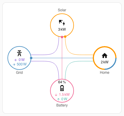
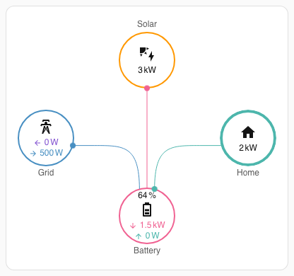
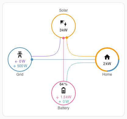
topology tells the card which wires exist between grid, solar, battery and home. The card only draws those wires and routes power along them.
| Value | Wires | For |
|---|---|---|
standard |
Every wire (default). | Most installations, AC or DC coupled. |
battery_hub |
Solar → battery, grid ↔ battery, battery → home. No solar → home, solar → grid or grid → home. | Portable power stations, UPS-style and off-grid inverters where every load runs through the battery. Power that would skip the battery passes through it instead, so home consumption stays the same. Needs a battery; without one the card uses standard. |
isolated_battery |
Every wire except grid ↔ battery. | Batteries that never charge from or discharge into the grid. A battery reading that would need that wire is credited to solar or home instead, so small sensor noise no longer draws a battery ↔ grid flow. |
Same readings with each topology (solar charging the battery, the grid topping up home):
standard |
battery_hub |
isolated_battery |
|---|---|---|
 |
 |
 |
In a sections dashboard, make the card taller in the dashboard editor or with grid_options.rows to line it up with the cards beside it. The rows of circles spread apart to fill the extra height, up to the spacing the columns get at full width. Past that, the circles stay centred and the lines follow them.
grid_options:
rows: 8With card-mod you can style each part of a circle. Every node's value has its own element, so it can be moved or recoloured without touching the icon or the secondary info:
| Node | Value | Icon | Secondary info |
|---|---|---|---|
| Grid | .grid .consumption, .grid .return |
#grid-icon |
.grid .secondary-info |
| Solar | .solar span.solar:not(.secondary-info) |
#solar-icon |
.solar .secondary-info |
| Battery | .battery .battery-in, .battery .battery-out |
#battery-icon |
.battery .secondary-info |
| Home | .home span.home:not(.secondary-info) |
#home-icon |
.home .secondary-info |
card_mod:
  style: |
    .home span.home:not(.secondary-info) {
      color: red;
      transform: translateY(-17px);
}Don't forget to change the entity ids
The following configurations will allow you to achieve your results with the least amount of lines of code / complexity. In these examples I decided to use the Split entities option, but feel free to use the combined entity option. More Info
type: custom:power-flow-card-plus
entities:
  grid:
    entity: sensor.grid_power
    power_outage:
      entity: sensor.power_outage
    display_state: one_way
    color_circle: true
kilo_threshold: 10000
This should give you something like this:

type: custom:power-flow-card-plus
entities:
  grid:
    entity:
      consumption: sensor.grid_consumption
      production: sensor.grid_production
      display_state: one_way
      color_circle: true
  solar:
    entity: sensor.solar_production
This should give you something like this:

type: custom:power-flow-card-plus
entities:
  grid:
    entity:
      consumption: sensor.grid_consumption
      production: sensor.grid_production
    display_state: one_way
    color_circle: true
  solar:
    entity: sensor.solar_production
  battery:
    entity:
      consumption: sensor.battery_consumption
      production: sensor.battery_production
    state_of_charge: sensor.battery_state_of_charge
    display_state: one_way
    color_circle: true
  home:
    color_icon: true
kilo_threshold: 10000
This should give you something like this:

This Configuration is a little bit random, it's just here to demonstrate the capabilities of this card.
type: custom:power-flow-card-plus
entities:
  home:
    entity: sensor.home_consumption
    color_icon: solar
  fossil_fuel_percentage:
    entity: sensor.fossil_fuel_percentage
    icon: mdi:pine-tree
    color_icon: true
    display_zero: true
    name: Non Fossil
    state_type: power
  grid:
    icon: mdi:ab-testing
    name: Provider
    entity:
      production: sensor.grid_production
      consumption: sensor.grid_consumption
  solar:
    icon: mdi:solar-panel-large
    entity: sensor.solar_production
  battery:
    name: Bateria
    icon: mdi:bat
    entity:
      consumption: sensor.battery_consumption
      production: sensor.battery_production
  individual:
    - entity: sensor.car_power
      icon: mdi:car-electric
      color: "#80b8ff"
      name: Denim Flash
      color_icon: false
    - entity: sensor.motorbike_power
      name: Qivi
      color_icon: true
      display_zero: true
      color: "#ff8080"
      icon: mdi:motorbike-electric
base_decimals: 0
kilo_decimals: 2
min_flow_rate: 0.9
max_flow_rate: 6
kilo_threshold: 10000
clickable_entities: true
title: Power Flow Card Plus
This should give you something like this:


Tip
I've made a lot of improvements in version 0.2 for the UI-Editor. Now each field has its own subpage, meaning there is now much less scrolling. The biggest change in the editor is the fact that you can now add up to 4 individual devices, all through the UI! 🥳

flow_rate_model picks how a line's value becomes the time one dot takes to travel a 175px line (see Line length):
flow_rate_model |
What moves linearly with power | Depends on other lines |
|---|---|---|
duration (default) |
time per dot | no |
speed |
dot speed (1 / time per dot) | no |
relative |
time per dot, by the line's share of total | yes |
Seconds per dot on a 175px line with the default min_flow_rate: 0.75, max_flow_rate: 6, min_expected_power: 0.01 and max_expected_power: 2000 (for relative, the line's share of all lines):
| Line value | duration |
speed |
relative |
|---|---|---|---|
| 0 W (0 %) | 6.00 | 6.00 | 6.00 |
| 250 W (12.5 %) | 5.34 | 3.20 | 5.34 |
| 500 W (25 %) | 4.69 | 2.18 | 4.69 |
| 1000 W (50 %) | 3.38 | 1.33 | 3.38 |
| 1500 W (75 %) | 2.06 | 0.96 | 2.06 |
| 2000 W or more (100 %) | 0.75 | 0.75 | 0.75 |
You may want to play around with max_expected_power, min_expected_power, max_flow_rate and min_flow_rate to get the speeds that you wish. use_new_flow_rate_model is the older way to choose: false means relative, true or unset means duration; flow_rate_model wins when both are set.
Lines have different lengths: the individual device lines are much shorter than the main lines, and the main lines differ from each other too. Every flow rate is the time a dot takes along a 175px reference line, about the solar and battery lines of a card in a 500px column, and each line's time is scaled by the square root of its length. A line a quarter as long takes half the time, so dots on short lines no longer crawl, without looping so often that they look faster than the main lines. This also applies to min_flow_rate, max_flow_rate and a fixed calculate_flow_rate: <number>: they are seconds per 175px of line. On a typical card the solar and battery lines keep their pace, the grid line is about 25% slower and the individual device lines are about twice as fast as before.
The time per dot shrinks linearly with the value, independently from other lines: a state of 10W always flows with the same velocity, no matter what other lines are doing. This is how the card behaved before 0.4.0-beta.0.
if (value > maxIn) return minOut; // above max_expected_power, use the fastest speed
return ((value - minIn) * (minOut - maxOut)) / (maxIn - minIn) + maxOut;

// value = value of the current line to calculate (eg: grid to home)
// minIn = min_expected_power, maxIn = max_expected_power
// maxOut = max_flow_rate (seconds per dot at min_expected_power)
// minOut = min_flow_rate (seconds per dot at max_expected_power)
// Below min_expected_power, dots move slower than max_flow_rate.Like duration it is independent from other lines, but the dot speed (one over the duration) grows linearly with the value, so twice the power looks about twice as fast. Mid-range values move noticeably faster than with duration. Values outside the expected range use the slowest or fastest speed.
progress = clamp((value - minIn) / (maxIn - minIn), 0, 1);
speed = 1 / maxOut + progress * (1 / minOut - 1 / maxOut);
return 1 / speed; // seconds for one dot to travel the lineBased on the official formula used by the Energy Distribution card. Each line's flow rate is relative to all the other lines.
max - (value / totalLines) * (max - min);
// max = max_flow_rate
// min = min_flow_rate
// value = line value, solar to grid for example
// totalLines = gridConsumption + solarConsumption + solarToBattery +
//   solarToGrid + batteryConsumption + batteryFromGrid + batteryToGrid
The following video aims to show the difference between the relative and an absolute flow formula:
REC-20230412155142.mp4
Notice that when the Power changes to only coming from the sun, the old formula accelerates to maintain a constant amount of dots/second. Using the new formula is more intuitive, since you can immediately see that the Solar Power is relatively low since the dots are flowing very slowly. On the old Flow Formula you might think that the sun is producing a lot of power, which in this case is not true.
At the end of the day these are two options and depending on what you're interested, one might suit you better than the other, that's why I kept the old formula, you have the choice. 🙂
Here is my to-do list containing a few enhancements I am planning in adding. The ones at the top are bigger priorities, so they’ll probably be available before the ones at the bottom.
- Change Tap Action Behavior to be compatible with Browser Mod
- Fill the circles #89
- More than two Individual Devices #54
- More than one solar source #23
- Display Connected/Disconnected status #111
- Grid Feed In Circle #119
- Improve performance #144
I am still just one person working on this project and obviously have other things going on in my life, so feel free to contribute to the project. You can also feel free to create a PR with a new feature and I'll try my best to review it 😊
Requires Home Assistant 2026.4 or later. On earlier versions a structured name falls back to the entity's friendly name.
Home Assistant composes an entity's display name out of its registry context
(entity, device, area, floor) rather than one friendly_name string. Any name
option in this card can be a list of those parts instead of a plain string, so
labels keep following renames and match what the built-in cards show:
entities:
  grid:
    entity: sensor.grid_power
    name:
      - type: area
      - type: entity
Available part types are entity, device, area, floor, and
text (a literal, written as {type: text, text: 'Grid'}). Parts that resolve to
nothing are dropped. A plain string name keeps working exactly as before, as does
use_metadata, which now takes the entity's composed name rather than its
friendly_name.
See the Home Assistant developer documentation for details.
This card is released under the MIT License.