A collapsible header + swipeable tabs for React Native, with a fluid pill tab bar and scroll positions that stay in sync across pages.
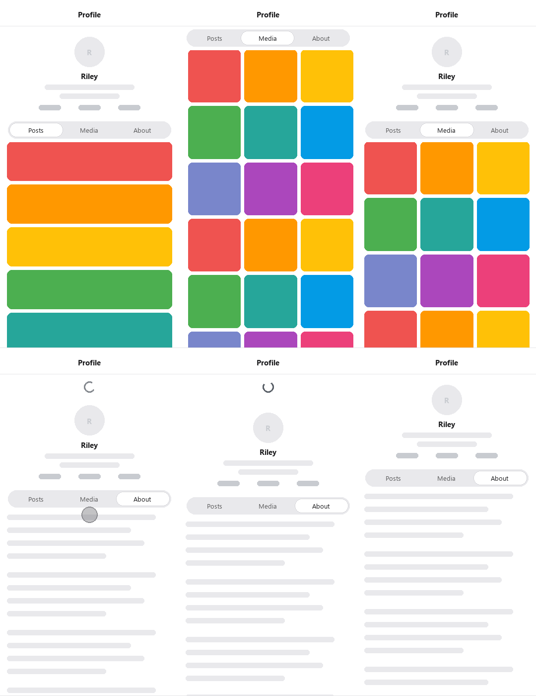
- 📉 Collapsing header — hides as you scroll, reveals as you pull down
- 📌 Optional pinned header — a status-bar-aware bar that floats on top
- 👆 Gesture-driven pager — horizontal swipe between tabs, no
react-native-pager-view - ⚡ Momentum grab — touch a flinging list to stop it and page sideways in the same gesture, like the X app
- 🔄 Synced scroll — pages keep their scroll position, so tabs don't jump on swipe
- 💊 Fluid pill tab bar — tracks fractional swipe progress; goes scrollable when tabs get crowded
- 📜 Drop-in lists —
LegendList(recommended),ScrollView,FlashList, andFlatList - 🎨 Bring your own tab bar — or use the styled default
- 📱 iOS, Android & web
Install · Quick start · Which list? · API · Notes · Web
npm install react-native-collapsible-fluid-tabsInstall the peer dependencies (see version requirements for minimums):
npm install react-native-reanimated react-native-gesture-handler react-native-safe-area-context react-native-workletsTabs.LegendList and Tabs.FlashList need their list package installed too — they're optional peers, so nothing ships in your app unless you use them:
npm install @legendapp/list        # for Tabs.LegendList
npm install @shopify/flash-list    # for Tabs.FlashList
iOS: run
npx pod-installafter installing — the peer dependencies (and FlashList) include native code.@legendapp/listis JS-only.
This library targets Gesture Handler 3 and Reanimated 4.4+ (tested with Reanimated 4.4 and Worklets 0.9.2):
| Peer dependency | Minimum version |
|---|---|
react-native-gesture-handler |
>= 3.0.0 |
react-native-reanimated |
>= 4.4.0 |
react-native-worklets |
>= 0.9.1 |
react-native-safe-area-context |
>= 4.0.0 |
@legendapp/list (optional) |
>= 3.2.0 |
@shopify/flash-list (optional) |
>= 2.0.0 |
1. Make sure your app is wrapped in GestureHandlerRootView and
SafeAreaProvider — Expo Router apps have both out of the box.
2. Enable Reanimated's synchronous UI-prop updates in your app's
package.json — and only these two flags:
"reanimated": {
  "staticFeatureFlags": {
    "ANDROID_SYNCHRONOUSLY_UPDATE_UI_PROPS": true,
    "IOS_SYNCHRONOUSLY_UPDATE_UI_PROPS": true
  }
}
With them, the header transform updates in the same frame as scroll. Rebuild native after changing these flags.
On Reanimated 4.4+, USE_COMMIT_HOOK_ONLY_FOR_REACT_COMMITS and FORCE_REACT_RENDER_FOR_SETTLED_ANIMATIONS are already enabled by default — you don't need to set them.
import { Tabs } from 'react-native-collapsible-fluid-tabs';

export function ProfileScreen() {
  return (
    <Tabs.Container
      renderHeader={() => <ProfileHeader />}
      tabBarHeight={56}
    >
      <Tabs.Tab name="posts" label="Posts">
        <Tabs.LegendList
          data={posts}
          keyExtractor={(p) => p.id}
          renderItem={({ item }) => <PostCard post={item} />}
        />
      </Tabs.Tab>

      <Tabs.Tab name="about" label="About">
        <Tabs.ScrollView contentContainerStyle={{ padding: 16 }}>
          <AboutContent />
        </Tabs.ScrollView>
      </Tabs.Tab>
    </Tabs.Container>
  );
}
That's the whole idea: a Tabs.Container holds Tabs.Tabs, and each tab renders one scrollable. The container handles the header, the pager, and keeping scroll in sync — you just pass your data and renderItem.
Every list is a drop-in for its underlying component and automatically gets header/footer spacers and scroll sync.
| Component | Best for | Virtualized |
|---|---|---|
Tabs.LegendList ⭐ |
Recommended for virtually all lists — feeds, grids, long timelines | ✅ |
Tabs.ScrollView |
Static or short content — about pages, forms, profiles | — |
Tabs.FlashList |
Only if you already standardize on Shopify FlashList | ✅ |
Tabs.FlatList |
Legacy — still exported, but LegendList is faster and smoother here | ✅ |
Tabs.ScrollView and Tabs.FlatList work with zero extra installs. Tabs.LegendList and Tabs.FlashList need their (optional-peer) list package — see Installation.
Each list manages a few props for you (onScroll, scrollEventThrottle, the scroll ref) and adds one extra:
minContentHeight— minimum content height for this page so short pages still scroll enough to collapse the header. Defaults to the container'sminPageContentHeight.
Everything else (data, renderItem, numColumns, keyExtractor, ListHeaderComponent, refreshControl, …) works exactly as it does on the underlying component.
Tabs.Container · imperative ref · Tabs.Tab · Tabs.DefaultTabBar · custom tab bar · hooks
The only required prop is children (your tabs). Everything else is optional — props are grouped below by what they affect.
Headers
| Prop | Type | Default | Description |
|---|---|---|---|
renderHeader |
(props: HeaderRenderProps) => ReactNode |
— | The collapsing header. Its measured height drives the collapse. Receives { scrollY, headerHeight, topInset, pinnedHeaderHeight } for header-internal animations. |
renderPinnedHeader |
(props: HeaderRenderProps) => ReactNode |
— | Optional header pinned to the top, always visible. Same render props. |
pinnedHeaderHeight |
number |
auto | Pinned header height excluding safe-area inset (added automatically). Omit to auto-measure from layout. |
estimatedHeaderHeight |
number |
0 |
Optional first-frame estimate for the collapsing header so list spacers don't jump on mount. Measured height always wins. |
Tabs & navigation
| Prop | Type | Default | Description |
|---|---|---|---|
children |
ReactNode |
— | One or more <Tabs.Tab>. Changing the number of tabs remounts the pager — see Notes. |
tabBarHeight |
number |
56 |
Height of the tab bar (matches the default bar; set it to match a custom one). |
initialIndex |
number |
0 |
Tab to start on (uncontrolled mode). |
index |
number |
— | Controlled active tab: when it changes the pager animates there. Pair it with onIndexChange and commit reported changes back to your state. Omit for uncontrolled mode. |
onIndexChange |
(index: number) => void |
— | Fires after a tab change (tap or swipe). |
scrollToTopOnTabPress |
boolean |
true |
Tapping the already-active tab scrolls its list back to the top, like X. |
renderTabBar |
(props) => ReactNode |
Tabs.DefaultTabBar |
Render your own tab bar. |
Swipe & motion
| Prop | Type | Default | Description |
|---|---|---|---|
swipeEnabled |
boolean |
true |
Enable horizontal swipe between tabs. |
swipeActivationDistance |
number |
15 |
Horizontal travel (dp) before a swipe activates. |
swipeFailDistance |
number |
10 |
Vertical travel (dp) that cancels a swipe in favor of scrolling. |
momentumSwipeFailDistance |
number |
40 |
Relaxed vertical fail threshold while a list is momentum-scrolling — makes mid-fling page swipes easier to land. |
swipeGestureTopInset |
'auto' | number |
'auto' |
Top area where the pager swipe won't activate. 'auto' excludes the header chrome; pass 0 for full-height swipes. |
springConfig |
SpringConfig |
damping 30, stiffness 200 |
Spring used to settle the pager after a swipe. |
pullDownBehavior |
'stretch' | 'static' |
'static' |
'static': chrome stays put, native refresh between header and list. 'stretch': page pulls down with the refresh indicator near the top (Android uses a built-in indicator — see Notes). |
Performance & layout
| Prop | Type | Default | Description |
|---|---|---|---|
lazy |
boolean |
false |
Mount tabs on demand instead of all upfront. |
lazyPreloadDistance |
number |
1 |
With lazy, how many neighboring tabs to pre-mount. |
minPageContentHeight |
number |
screen + header height | Minimum content height per page, so short/empty pages can still scroll enough to collapse the header. The default is computed from the measured header. |
containerStyle |
StyleProp<ViewStyle> |
— | Style for the outermost view. Set a backgroundColor — see Notes. |
Drive the active tab from outside (deep links, etc.). Use the controlled index prop if you prefer state over a ref.
import { useRef } from 'react';
import { Tabs, type TabsRef } from 'react-native-collapsible-fluid-tabs';

const tabsRef = useRef<TabsRef>(null);

tabsRef.current?.setIndex(2);         // animate to the third tab
tabsRef.current?.setIndex(2, false);  // jump instantly
const index = tabsRef.current?.getIndex();

<Tabs.Container ref={tabsRef}>{/* ... */}</Tabs.Container>;| Method | Signature | Description |
|---|---|---|
setIndex |
(index, animated?) => void |
Move to a tab (clamped). animated defaults to true. |
getIndex |
() => number |
The current snapped tab index. |
| Prop | Type | Description |
|---|---|---|
name |
string |
Stable identifier (used as the key). |
label |
string |
Optional label for the default tab bar. |
icon |
ReactNode |
Optional icon for the default tab bar. Any node — an <Image>, an SVG, a vector-icon. |
badge |
string | number | boolean |
Optional badge: a string/number renders a count bubble, true a small dot. Custom tab bars receive it on TabConfig. |
children |
ReactNode |
The tab's content — typically one of the list components. |
Rendered automatically. You only reference it when composing your own renderTabBar:
renderTabBar={(props) => (
  <Tabs.DefaultTabBar
    {...props}
    colors={{
      background: '#fff',
      pillBackground: '#000',
      labelColor: '#000',
      iconTint: '#000',
      trackBackground: 'rgba(0,0,0,0.06)',
    }}
  />
)}
It's adaptive: equal-width pills when tabs fit, and a horizontally scrollable, content-width pill (auto-scrolling the active tab into view) once tabs would get cramped.
| Prop | Type | Default | Description |
|---|---|---|---|
colors |
DefaultTabBarColors |
— | background, pillBackground, trackBackground, iconTint, labelColor, badgeBackground, badgeText. |
scrollable |
'auto' | boolean |
'auto' |
'auto' chooses equal-width vs. scrollable; true/false force it. |
minTabWidth |
number |
88 |
In 'auto', switch to scrollable once equal tabs would be narrower than this. |
sidePadding |
number |
16 |
Horizontal padding around the pill. |
renderTabBar receives TabBarRenderProps (exported from the package): tab configs, activeIndex, pagerOffset, headerHeight, perPageScrollY, onTabPress, and the rest. Use it with useAnimatedStyle for a bar that tracks live swipe progress.
For collapse motion, read the active tab's offset from perPageScrollY[activeIndex] (same as the built-in header) — not scrollY alone. During same-tab scroll-to-top, optional scrollToTopIndex / scrollToTopOffset are set so chrome can follow the animation; see Tabs.DefaultTabBar for reference.
useCollapsibleHeader() — build a custom sticky element inside a tab (a filter bar, segmented control, …). Call it inside a <Tabs.Container>:
import { useCollapsibleHeader } from 'react-native-collapsible-fluid-tabs';
import Animated, { useAnimatedStyle } from 'react-native-reanimated';

function FilterBar() {
  const { collapseProgress, contentTop } = useCollapsibleHeader();
  const style = useAnimatedStyle(() => ({ opacity: 1 - collapseProgress.value }));
  return <Animated.View style={[{ top: contentTop }, style]}>{/* … */}</Animated.View>;
}
Returns { scrollY, headerHeight, collapseProgress (0→1), pinnedHeaderHeight, tabBarHeight, topInset, contentTop }.
useTabsContext() and useTabIndex() are also exported for lower-level use.
- Changing the tab count remounts the pager and resets scroll positions. Keep the count stable; hide content per-tab instead of adding/removing tabs.
- Set a background on
containerStyleso nothing flashes through during overscroll. - RefreshControl on Android — import from
react-native-gesture-handler, notreact-native. RN's control often needs a second pull inside the pager.'static'mode auto-setsprogressViewOffset;'stretch'mode uses the Container's built-in pull indicator (still driven by yourrefreshing/onRefresh). - Android overscroll — lists default to
overScrollMode="never": Android 12+'s stretch overscroll moves the list's pixels without emitting scroll events, so the header can't follow it and a seam opens under the chrome. Override it per-list if you accept that trade-off. - Reduced motion — tab changes jump instantly when the OS setting is on.
Supported on react-native-web. Tabs.LegendList is the default choice here too — plain FlatList scroll events can settle a frame late in the browser.
MIT